
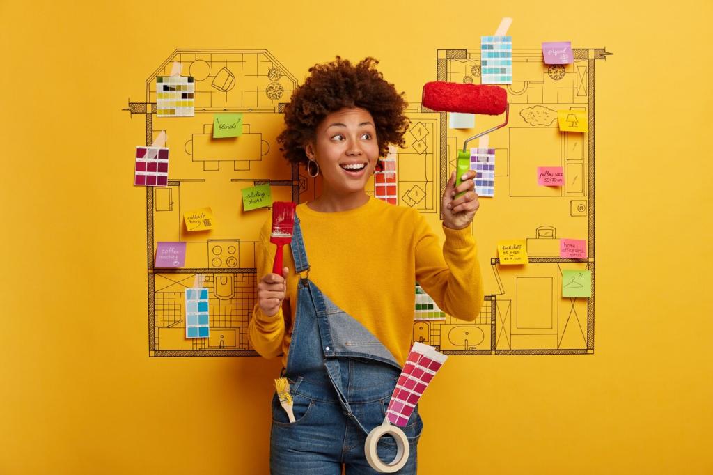

Avoiding Pitfalls: Little Tweaks, Big Payoffs
A pink-beige sofa can clash with a green-gray wall even if both seem neutral. Compare swatches against true white to reveal undertones. If they fight, adjust warmth or choose a bridge textile that harmonizes both. Tell us your trick for spotting undertones quickly.
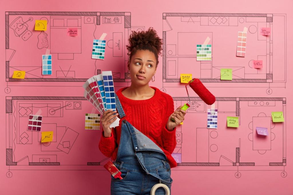
Avoiding Pitfalls: Little Tweaks, Big Payoffs
Too many intense colors compete for attention. Dial back by choosing one hero hue, then support with tints and tones. Keep large surfaces softer, reserving saturation for accents. Sampling saves regrets—try three depths of the same color and notice your breathing ease.
Avoiding Pitfalls: Little Tweaks, Big Payoffs
Trends inspire, but your home is long-term. Translate a hot terracotta into a throw, planter, or art frame before committing to walls. If you still love it after a season, upgrade. Subscribe for our quarterly palette refresh guide to evolve without whiplash.