The Psychology of Color in Home Decor
Today’s chosen theme: The Psychology of Color in Home Decor. Explore how hues shape mood, behavior, and daily comfort, and learn to curate rooms that truly support your life. Join the conversation, share your color stories, and subscribe for fresh inspiration.
How Color Shapes Mood at Home
Warm colors like terracotta and ochre feel social and intimate, nudging people closer, while cool blues and greens offer exhale energy and mental spaciousness. Notice how your shoulders drop in a sage-toned nook or how conversation sparks near a soft coral wall. Share a moment you felt color change the vibe at home, and tell us which temperature your household gravitates toward.
How Color Shapes Mood at Home
Highly saturated hues buzz with urgency, which can be thrilling for a gallery wall but exhausting beside your pillow. Meanwhile, low-saturation tones act like background music, steadying the nervous system. Contrast creates rhythm: a navy sofa against pale linen heightens clarity, while tone-on-tone layers soothe. Comment with a room where saturation surprised you, and subscribe for weekly cues to balance intensity with ease.
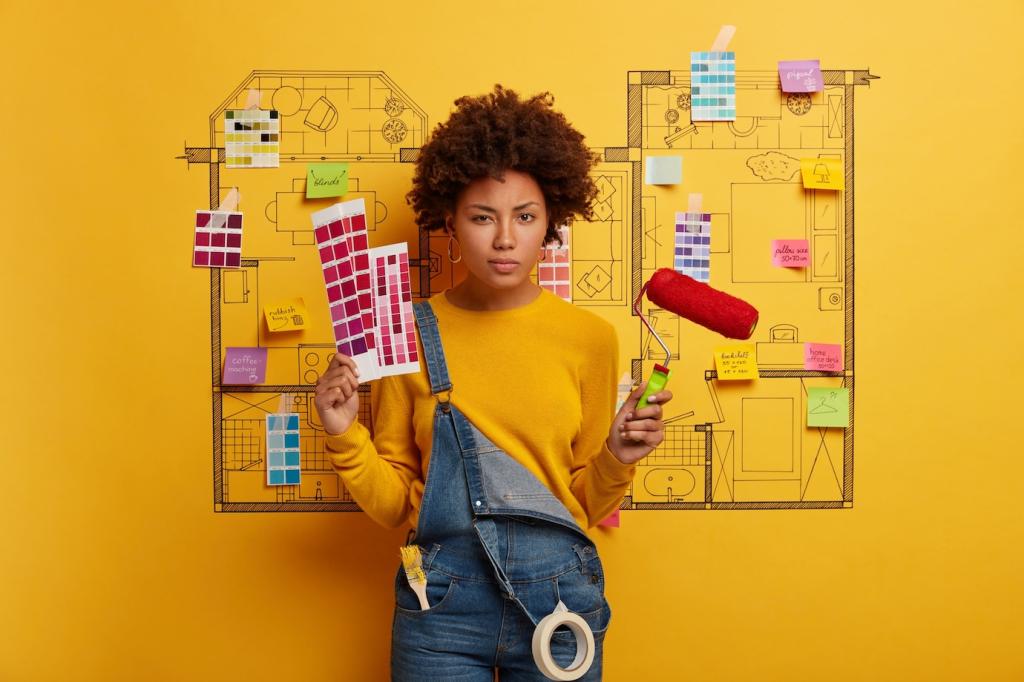
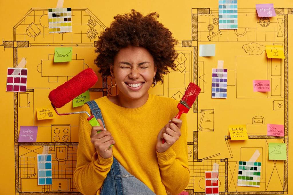
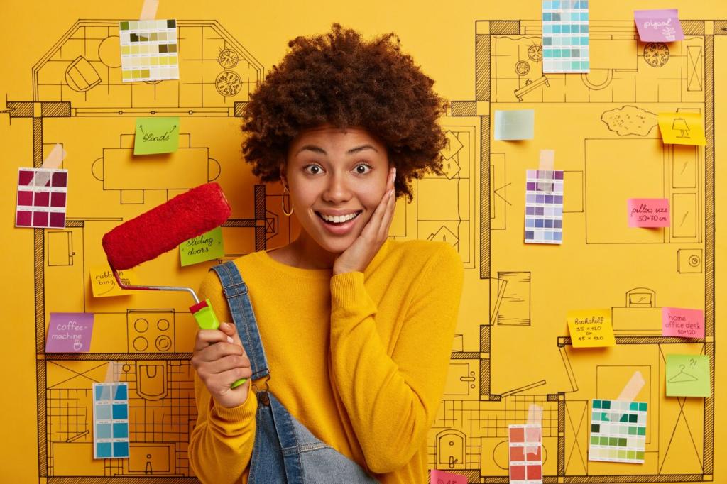
Room-by-Room Palettes with Purpose
Restful Bedrooms
Sea-glass green, dusty lavender, and foggy blue encourage slower breathing and gentle transitions into sleep. Keep saturation low and finishes matte to avoid glare near bedtime. Soft ivory trims and natural linen bedding help colors feel breathable. Which bedtime hue calms you fastest after a long day? Share your pick and tell us how it pairs with your evening ritual.
Energizing Kitchens and Dining
Sunlit yellows, apricot, or ripe tomato accents wake appetite and conversation, especially when grounded by wood and stone. Use bolder hues on stools, art, or pantry doors rather than every wall, keeping mornings bright without fatigue. What color makes your coffee taste happier? Comment below, and subscribe for a palette guide that pairs color with your cooking style.
Focused Home Offices
Blue-greens, softened charcoal, and muted teal promote concentration by narrowing visual noise. Add a single optimistic accent, like saffron stationery, to spark momentum without stealing focus. Test your background color on video calls to ensure skin tones look natural. Tell us your current desk color and how it affects your attention span during deep work.
Light, Materials, and Finish
North light cools colors, making beiges read gray and blues feel crisp. West light warms dramatically at sunset, turning neutrals honey-gold. Always test large swatches on multiple walls and watch them morning, noon, and evening. What surprised you most about your home’s light path? Share your observation to help others avoid mismatched paint buys.
Light, Materials, and Finish
Matte paint absorbs light and calms busy palettes, while eggshell and satin bounce brightness and emphasize movement. Rough textures like plaster or boucle soften shadows, making deeper hues feel welcoming, not heavy. Try pairing velvet cushions with a mid-sheen sideboard to balance comfort and clarity. Post a photo of your favorite texture combo and tell us why it works.
Personal and Cultural Color Meanings
Crimson may signal celebration in one culture and solemnity in another. White can mean renewal or mourning depending on context. Respecting these nuances deepens hospitality for guests and roommates. Research your household’s traditions and weave them into accents that feel authentic. Share a color custom you cherish, and teach our community what it means to you.
A childhood quilt might make mustard yellow feel nostalgic, while a seaside trip anchors love for slate blue. When a hue feels mysterious, ask what memory it touches. Build your palette from two comfort colors, then add one daring note. What memory-filled color must live in your home? Comment and inspire someone’s next swatch test today.
If one person craves vibrancy while another needs quiet, zone the room with layered color intensity. Keep common walls balanced and use pillows, throws, or a reading chair to satisfy bolder preferences. Host a weekend swatch vote with tea and playlists. Tell us your winning compromise and whether the experiment brought more harmony to shared spaces.
Accents, Art, and Seasonal Shifts
Accent walls anchor attention but can dominate. If you hesitate, try moveable color first: lampshades, frames, planters, and throws. These edits rehearse the feeling before paint commits the room. Which accent gives you the most joy per dollar? Share your MVP item and why it changed your space’s energy.
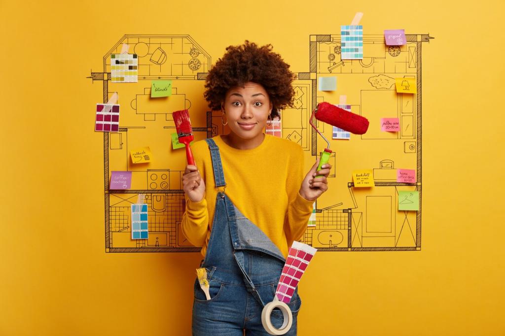
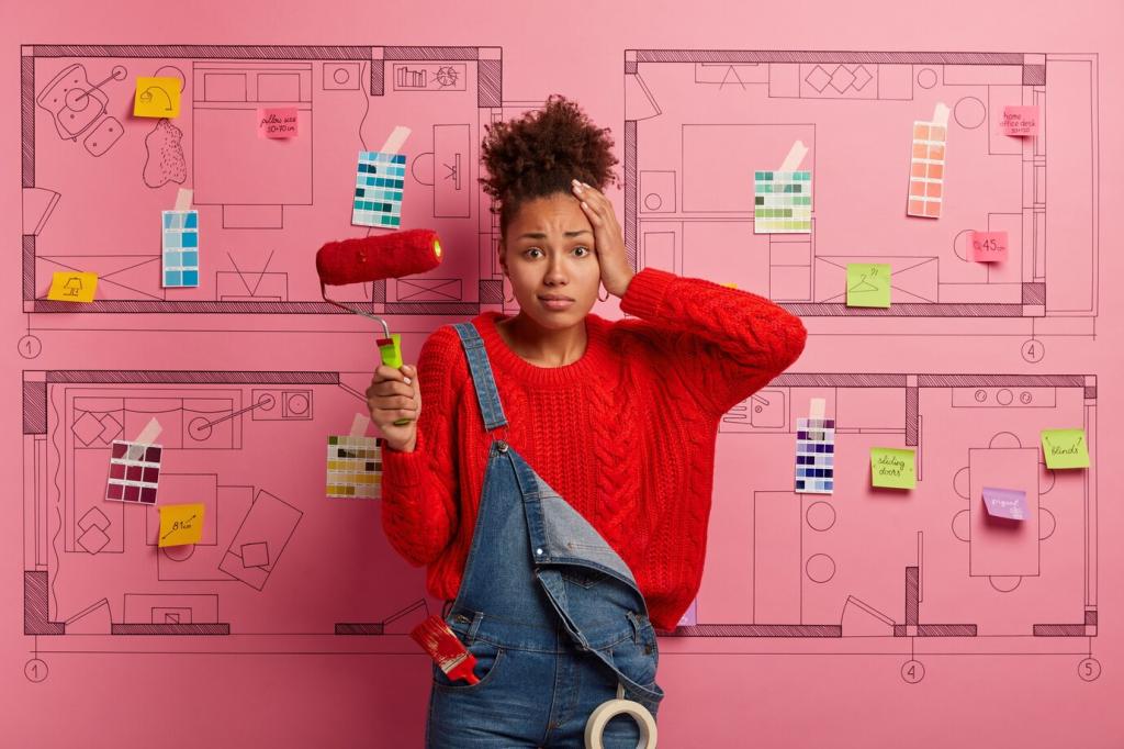
Testing, Tools, and Tiny Risks
Paint large poster-board swatches and tape them near curtains, art, and flooring. Build a mood board that includes finishes and fabrics, then journal how the palette feels during different tasks. Your notes will reveal patterns your eyes skim past. Share a snapshot of your board, and tell us the single insight it gave you.