

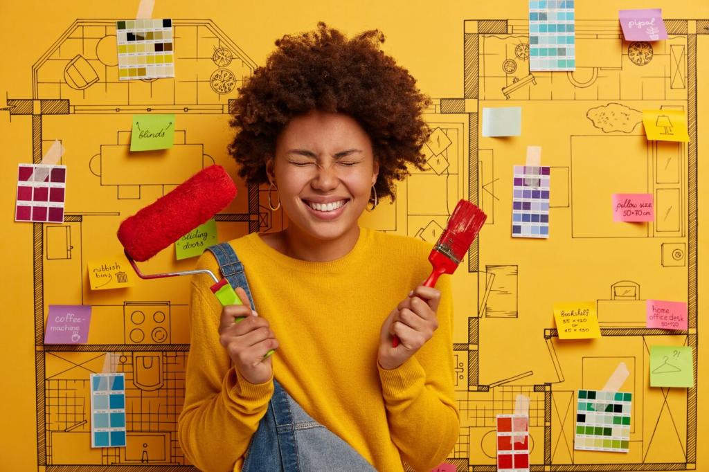
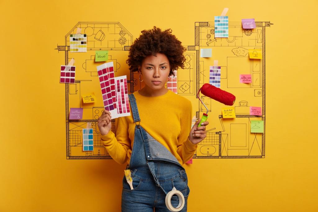
Monochromatic Color Palettes: Creating a Unified Look
Chosen theme: Monochromatic Color Palettes: Creating a Unified Look. Explore how a single hue, expanded through tints, tones, and shades, can bring calm, cohesion, and surprising depth to your spaces and designs. Stay with us, share your favorite base hue in the comments, and subscribe for fresh, theme-driven inspiration.
What Monochromatic Really Means
Hue, Tints, Tones, and Shades Defined
A monochromatic palette begins with a single hue, then expands through tints by adding white, tones by adding gray, and shades by adding black. Imagine a journey from deep navy to powder blue, each step related yet distinct, creating harmony without sacrificing variety or character.

Why Visual Unity Feels Calm
Unified palettes reduce visual noise and decision fatigue. Gestalt’s law of similarity helps our brains read spaces more comfortably when elements share a related color family. That calm can translate into better focus, easier styling, and fewer impulse buys, because everything already works together beautifully.
Match Mood to Hue
Start with how you want to feel. Blues often suggest clarity and calm, clay and terracotta bring warmth, and charcoal can feel elegant and grounding. Consider your lifestyle, routines, and energy level, then commit to a hue that supports the feelings you want daily in your space.

Read the Light Before You Commit
Natural light changes color perception dramatically. North-facing rooms cool hues down, southern exposure warms them up. Paint swatches on multiple walls and observe morning to evening. If your chosen hue skews cold in your light, try a version with a gentle warm undertone to rebalance it.
Swatch, Sample, and Simulate
Create a grid of three to five tints, tones, and a deep shade of your base hue. Test on large sheets, move them around, and photograph at different times. Use digital mockups to preview combinations, then share your finalists with us to crowdsource feedback from fellow monochrome lovers.
Building Your Palette: Proportions and Variety
As a starting point, let roughly sixty percent be a comfortable mid-tone, thirty percent a lighter tint, and ten percent a deep, dramatic shade. This simple ratio creates structure and rhythm. Adjust thoughtfully for smaller rooms, bright surfaces, or moody, cocooning environments that crave more depth.
When color is held constant, texture tells the story. Pair soft knits with ribbed glass, honed stone with brushed metal, or matte paint with silk. In one hallway makeover, switching to woven runners and satin cabinetry in a single sage hue added dimension without introducing any competing colors.
Fine-tune your palette by mixing matte, eggshell, and gloss finishes of the same hue, and choose slightly warmer or cooler variations to suit the light. A cooler slate headboard and warmer slate linen can coexist, creating subtle contrast. Keep undertones aligned so the family still reads coherent.
Room-by-Room Monochrome Ideas
Living Room: Conversation-Friendly Cohesion
Try a deep blue base on a media wall, balanced by mid-tone blue upholstery and airy pale cushions. Anchor with a tone-on-tone rug, then layer ceramic vases in soft steel blue. Guests will notice the serenity, not the styling effort, and conversations flow when the space visually holds them gently.
Kitchen: Clean Lines, Consistent Tones
Choose a graphite base for cabinets, lighter graphite on walls, and a near-black shade for hardware. A satin backsplash tile in the same family reflects light without introducing new hues. The result feels crisp, modern, and easy to maintain, a kitchen that supports cooking rather than competing with it.
Bedroom: Restful Gradients
Select a soft clay headboard, lighter clay walls, and deeper clay bedding accents. Add linen and wool for tactile richness, and let bedside lamps cast warm pools of light that enrich the tones. Readers tell us they fall asleep faster and wake calmer when the room’s color family whispers, not shouts.
Branding and UI: Mono with Meaning
Reserve your deepest shade for primary actions, mid-tones for headers, and lighter tints for backgrounds and dividers. Using scale and value, not extra hues, clarifies interactions. Try building a clean set of eight steps in your design tool, then share screenshots to discuss which steps feel most balanced.
Branding and UI: Mono with Meaning
Monochrome still demands strong contrast. Aim for text contrast ratios meeting WCAG 2.1 AA, often 4.5 to 1 for body copy. Test states like hover, focus, and disabled across your value scale. Invite users with varying devices to try your prototype and report where readability falters or shines.

Budget, Sustainability, and Smart Sourcing
Gather items already in your hue family, even if they vary slightly in value. Group similar pieces, then rehome or donate the outliers. One reader repainted frames and lamp bases to match their charcoal palette, saving money while transforming clutter into a quietly curated, monochromatic gallery wall.
Budget, Sustainability, and Smart Sourcing
Before big commitments, buy sample pots and test generously. Fabric dyes can bring throws and slipcovers into your palette. Wood stain or color-matched spray paint refreshes accessories. Share your before and after photos with us, and we will feature a roundup of the most inventive, wallet-friendly makeovers.
Styling, Maintenance, and Sharing Your Story
Swap materials, not hues. In winter, layer wool and velvet in deeper values; in summer, rotate to linen and glazed ceramics in lighter tints. This approach keeps your identity intact while evolving with the seasons. Tell us which seasonal texture shift makes your palette feel most alive and enjoyable.